Info
Role
Product Designer
Timeline
3 weeks
Focus
Design Systems, Accessibility, Brand Alignment
Platforms
Web applications
Team
Product Owner
Project Manager
Tech Lead
Developers
(Back/Front - End, QAs)
Context
The Project
During my tenure at Deloitte Design System team, I was tasked with solving a critical design challenge that was impacting our entire product ecosystem.
Our diverse portfolio of applications suffered from inconsistent colour usage, accessibility issues, and a little disconnect from Deloitte's brand identity.
What started as a colour audit evolved into a comprehensive design system transformation that would redefine how our teams approach visual design across all platforms.
"How might we create a colour system that scales with our growing product portfolio while maintaining accessibility and brand integrity?"
Outcome
The redesigned colour system established a scalable, accessible foundation that reduced design decision fatigue by 70%, improved WCAG compliance across all platforms, and created a unified visual language that strengthened brand consistency while empowering teams to build faster and more cohesively.
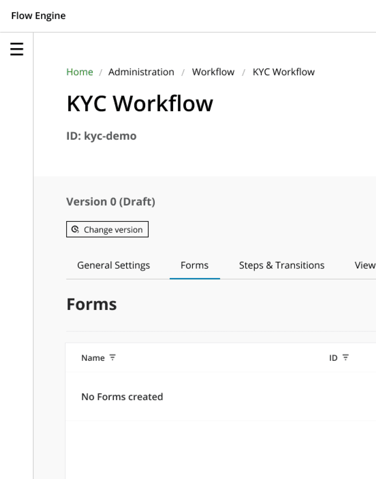
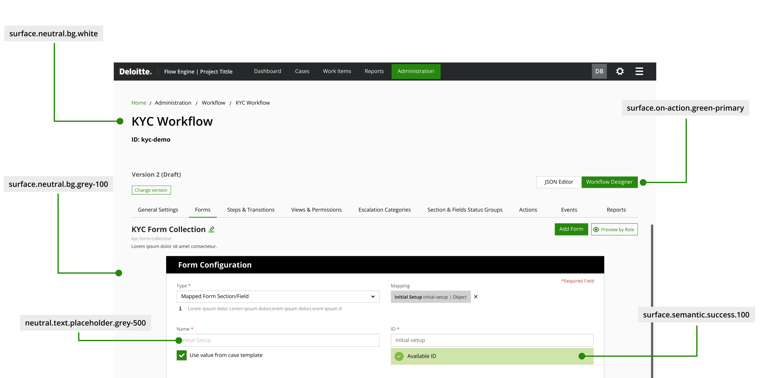
UI Audit
This example illustrates how platforms were being shipped without proper design system foundations, resulting in interfaces that may function but fail to provide optimal user experience or brand consistency. The lack of systematic colour guidelines creates maintenance challenges and inconsistent user interactions across the platform.
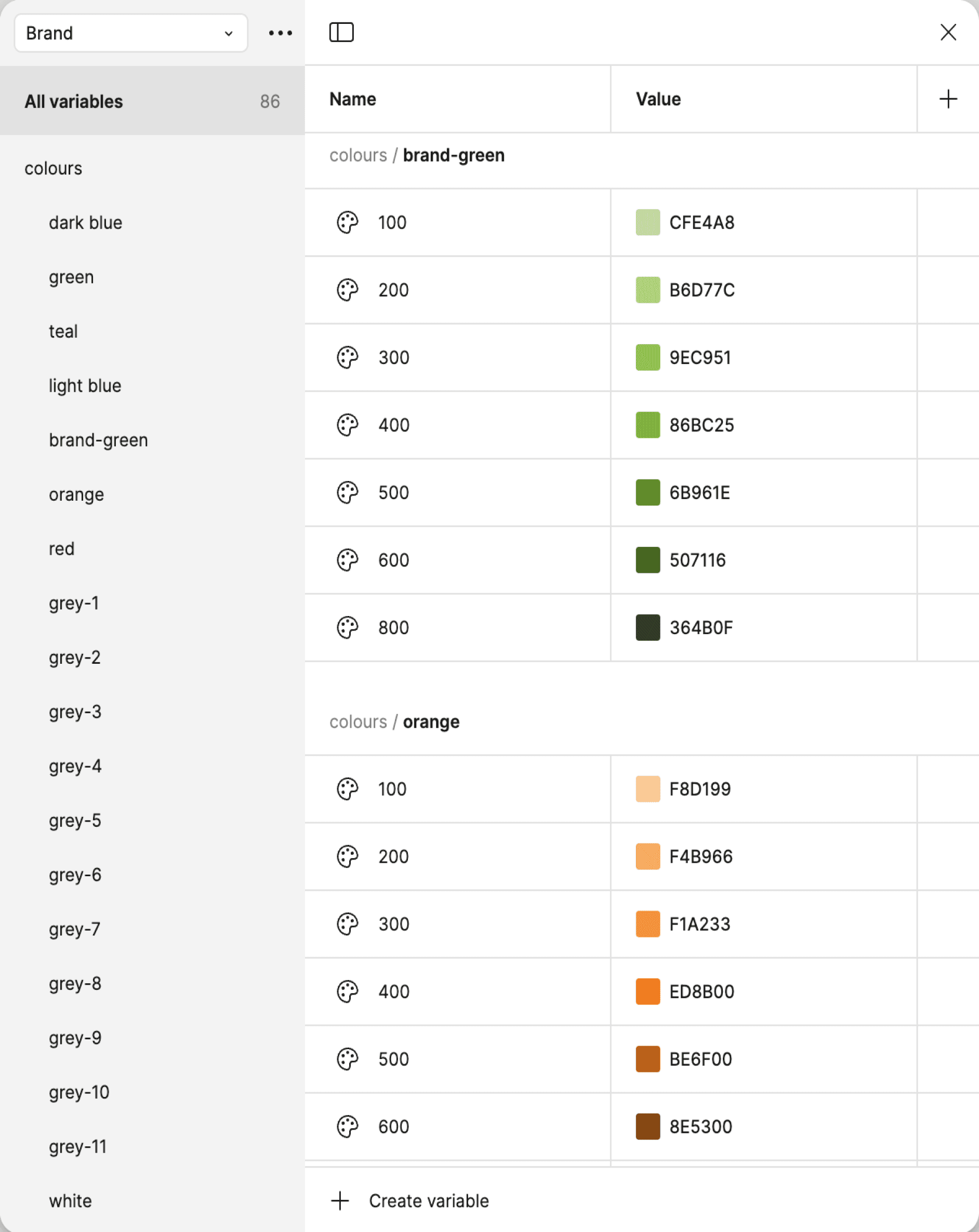
Existing colour palette
The existing colour system shown here represented Deloitte's official brand palette, carefully developed by their branding team for traditional marketing and print applications. This comprehensive palette included over 40 colour variations organised into primary, secondary, and tertiary categories, each with specific hex values and naming conventions.
greens and blues
Primary palette
$deloitte-green
#86bc25
$primary-teal
#0D8390
$primary-blue
#007CB0
$primary-green-1
#43B02A
$primary-green-2
#26890D
$primary-green-3
#046A38
base & Alerts colours
$black
#000
$gray-8
#27282A
$white
#fff
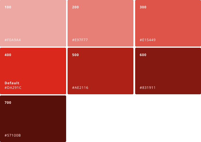
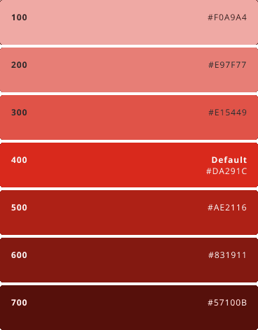
$red
#DA291C
$orange
#ED8B00
$yellow
#FFCD00
Background & Greys
secondary palette
$background-gray-1
#FAFAFA
$background-gray-2
#F5F5F5
$background-gray-3
#EBEBEB
$gray-1
#D0D0CE
$gray-2
#BBBCBC
$gray-3
#A7A8AA
$gray-4
#97999B
$gray-5
#75787B
$gray-6
#63666A
$gray-7
#53565A
bright shades
$bright-green
#0df200
$bright-teal
#3efac5
$bright-blue
#33f0ff
greens, TEALS and blues
Tertiary palette
$secondary-green-1
#E3E48D
$secondary-green-2
#C4D600
$secondary-green-3
#009A44
$secondary-green-4
#2C5234
$secondary-teal-1
#DDEFE8
$secondary-teal-2
#9DD4CF
$secondary-teal-3
#6FC2B4
$secondary-teal-4
#00ABAB
$secondary-teal-5
#0097A9
$secondary-teal-6
#007680
$secondary-teal-7
#004F59
$secondary-blue-1
#A0DCFF
$primary-teal
#0D8390
$secondary-blue-2
#62B5E5
$secondary-blue-4
#0076A8
$secondary-blue-5
#005587
$secondary-blue-6
#012169
$secondary-blue-7
#041E42
Part One:

Part Two:
Building the Foundation
2.1 Collaboration Strategy
Working closely with Deloitte's Brand team became crucial early in the process. The existing colour palette was optimised for print applications and needed fundamental adaptation for digital environments. This collaboration ensured that our new system would maintain brand integrity while serving the practical needs of web applications.
Part Three:
Designing the Solution
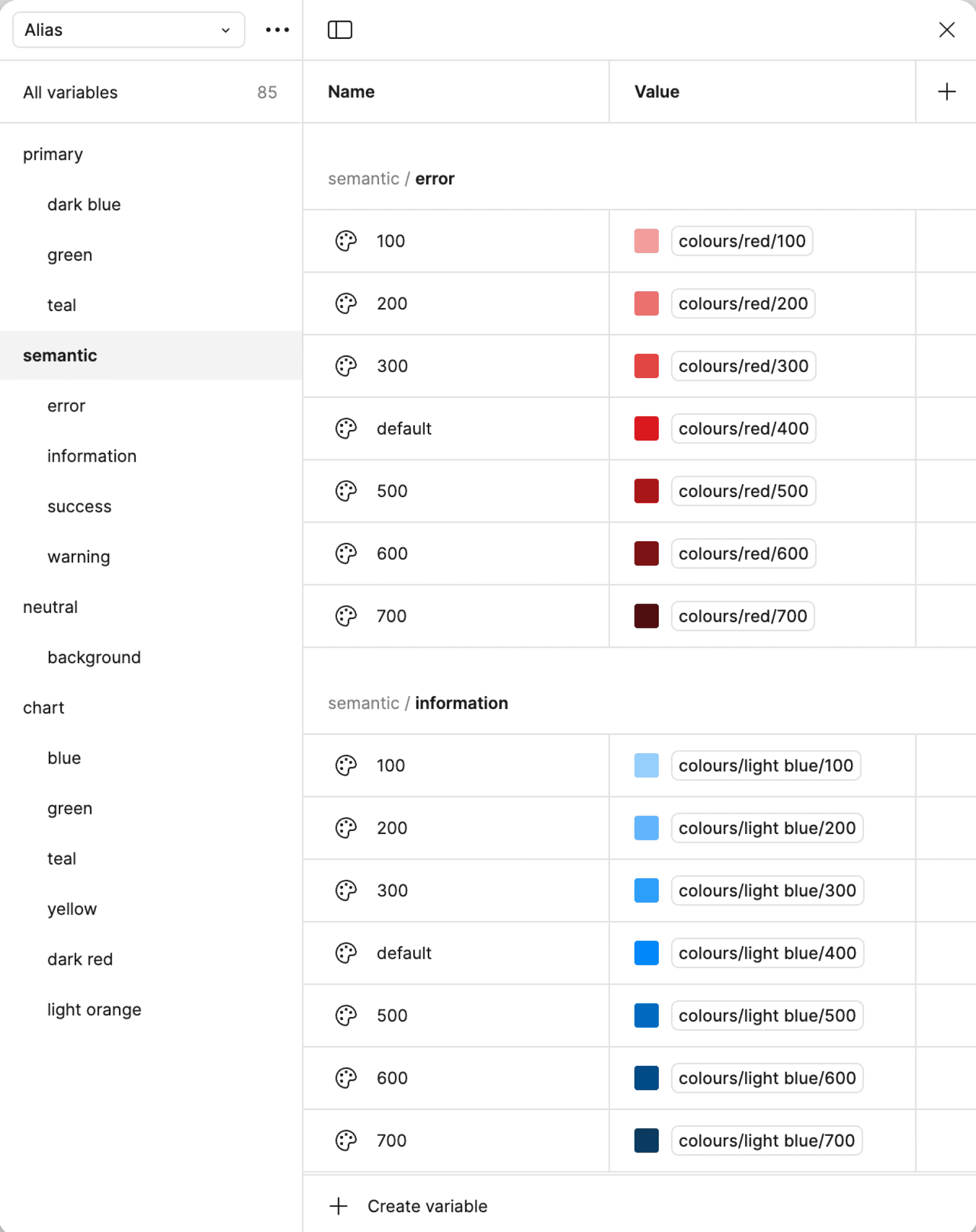
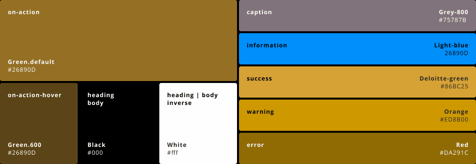
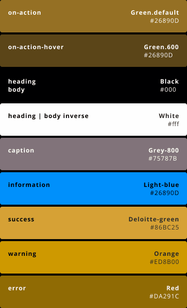
3.1 Key Feature 1 - Semantic Colour Roles
The biggest breakthrough was establishing a rule of 100 that redefined colours with clear semantic roles. Expanding the spectrum of existing colours provided flexibility when choosing and forming colour groups, and instead of arbitrary names, each colour now served a specific purpose:
Primary Colours: Core brand colours for key actions and brand moments
Secondary Colours: Alert colours. Success, warning, error, and information states
Neutral Colours: Typography, backgrounds, and structural elements
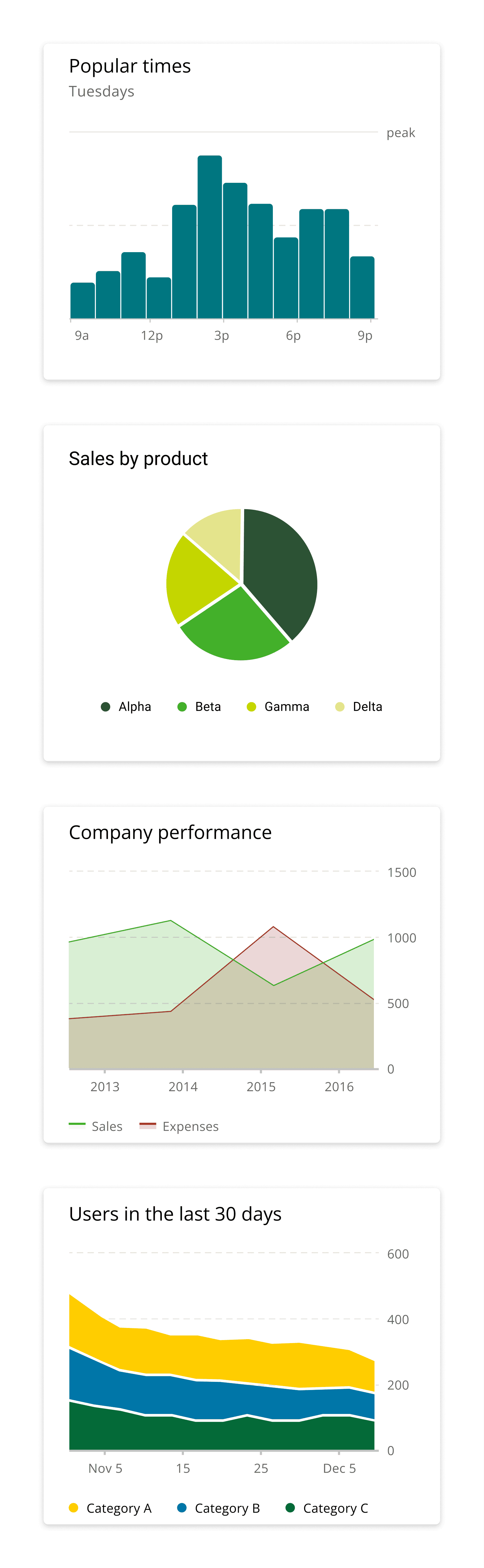
Data Visualisation Colours: Specially curated palette for charts and graphs


3.3 Key Feature 3 - Theme Flexibility
The new system supported multiple built-in themes, allowing for:
Light and dark mode compatibility
High contrast options for accessibility
Brand-specific themes for different product lines
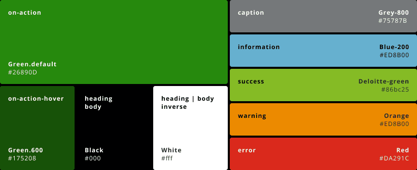
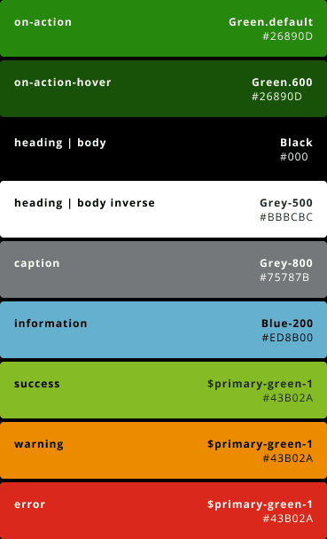
(F)
The appropriate use of certain colours in the design system was critical in making data visualisation successful by ensuring adequate contrast from primary colour groups, limiting single-colour usage per chart to maintain brand consistency, and applying semantic colour meaning across different chart types for intuitive user comprehension.
(A)
Before and After
We consolidated the interface from competing blue and green primary colours to a unified theme system, establishing a primary colour as the singular colour for all interactive elements while keeping graph and visualisation elements distinctive, creating stronger brand consistency and reducing cognitive load for users.
Part Four:
Validation and Testing
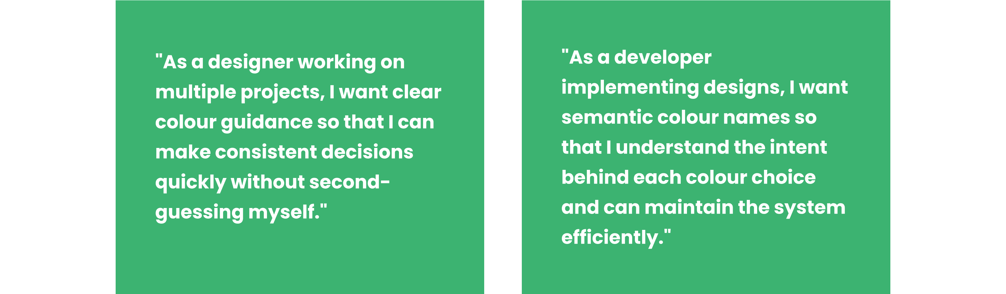
4.1 Focus Group Insights
After developing the initial system, I conducted focus groups with both designers and developers to gather feedback on the proposed changes.
Testing Objectives:
Evaluate the intuitiveness of the new token naming system
Assess the effectiveness of accessibility improvements
Validate that the system met diverse workflow needs
Identify any remaining pain points or friction areas
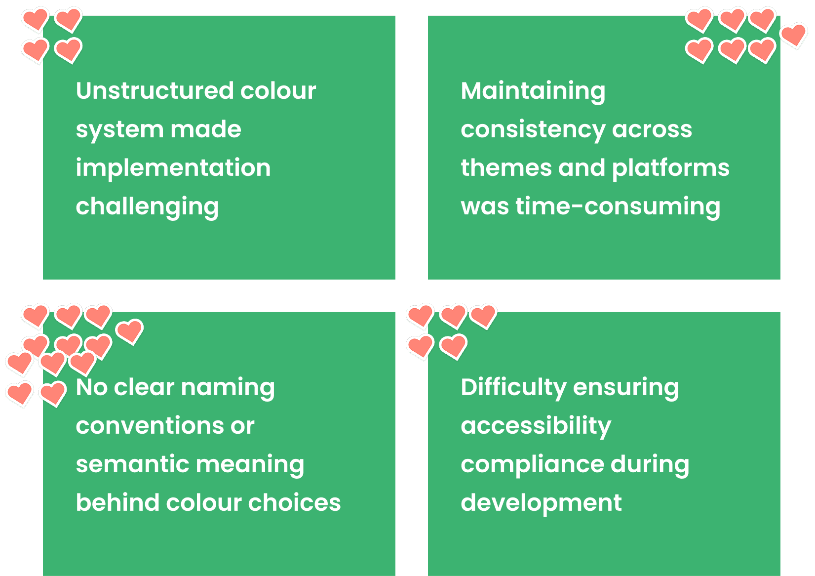
4.2 What the Teams Said


4.3 Iterative Refinements
Based on feedback, I made several key adjustments:
Enhanced Documentation: Created comprehensive usage guidelines with real-world examples
Migration Support: Facilitate meetings and workload to help teams transition existing projects gradually
Training Materials: Built workshops to help teams understand and adopt the new system
Part Five
5.1 Rollout Strategy
The implementation was carefully orchestrated across three phases:
Phase 1: Documentation and training for design and development teams
Phase 2: Implementation in new projects and major updates
Phase 3: Gradual migration of existing applications
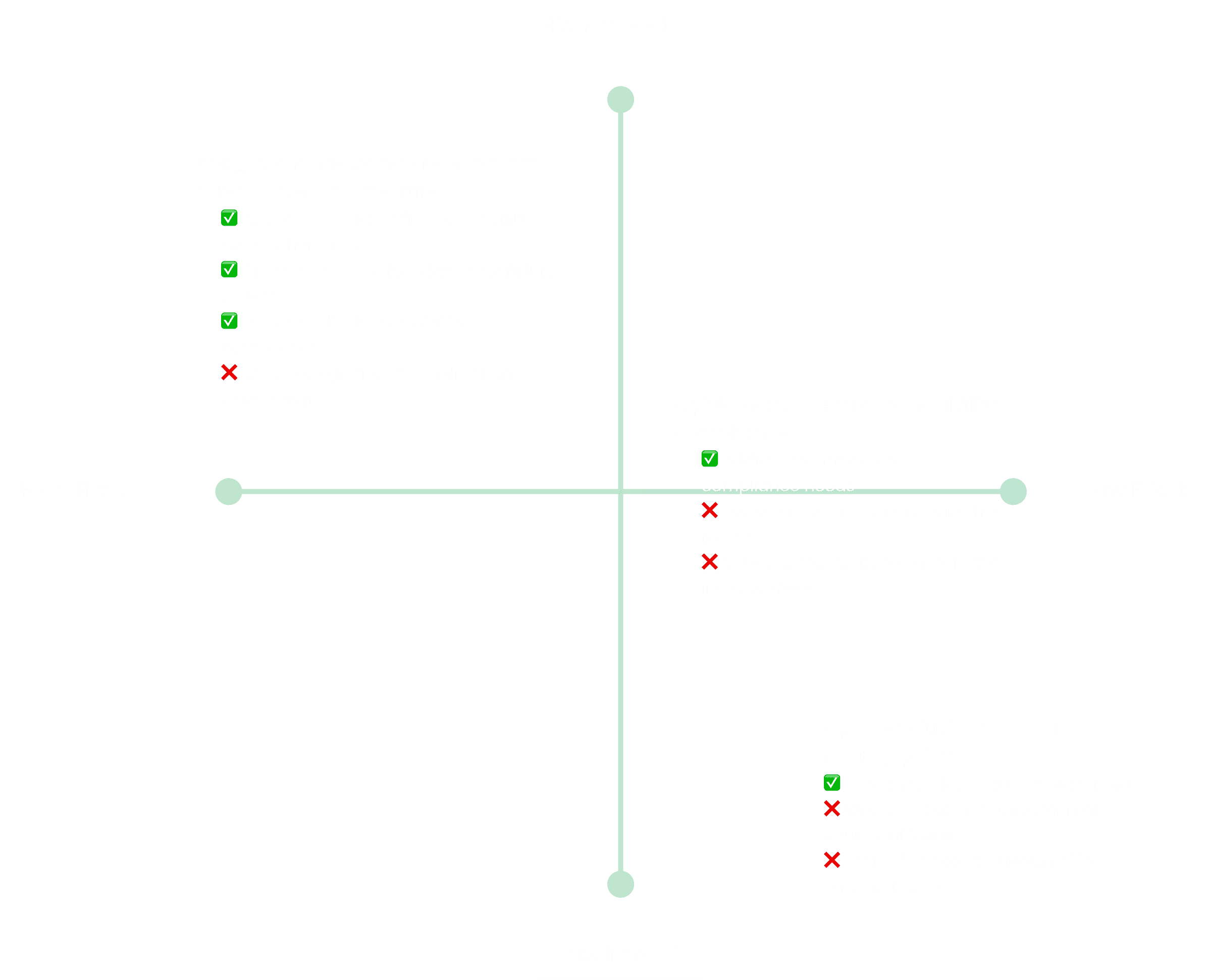
5.2 Measuring Success
In the first 2 months after rolling out the new colour system.
Quantitative Results:
70% reduction in colour-related design decisions during project work
100% WCAG AA compliance across all new implementations
60% faster developer implementation of colour changes
40% reduction in colour-related bug reports
Qualitative Improvements:
Increased confidence in design decisions
Stronger brand consistency across all touch-points
Improved collaboration between design and development teams
Better accessibility outcomes for end users
5.3 Long-term Impact
The new colour system became the foundation for broader design system improvements, enabling:
Faster onboarding of new team members
More efficient cross-team collaboration
Stronger brand presence in the market
Better user experiences across all applications
Key Learnings
This project reinforced several important principles about design systems work:
1. Systems thinking requires deep user empathy - Understanding the needs of internal users (designers and developers) was just as important as considering end-user needs.
2. Accessibility isn't optional - Building accessibility into the foundation of the system was far more effective than trying to retrofit it later.
3. Change management is design work - The success of a design system depends heavily on adoption, which requires careful attention to communication, training, and transition planning.
4. Collaboration amplifies impact - Working closely with brand, engineering, and product teams created better outcomes than working in isolation.
Through this project, I learned that effective design systems aren't just about creating beautiful, consistent interfaces—they're about empowering teams to work more efficiently while ensuring that every user interaction reflects both usability best practices and brand values.
The true measure of success wasn't just in the visual improvements, but in how the system enabled better collaboration and more inclusive user experiences across our entire product ecosystem.
You may also like