UX Research | Usability Testing
SaaS
Financial Services
Usability Testing
Case Management
Heuristics Evaluation
Client
Deloitte UK
Timeline
1 month
Role
UX Researcher

Introduction
Flow Engine, a SaaS case management product developed by Deloitte, is utilised in critical applications like KYC (Know Your Customer) and AML (Anti-Money Laundering).
This research project focused on improving the user experience for the Case Template configuration feature by identifying usability issues and proposing enhancements.
Problem
The Case Template feature needed to be updated to improve user experience by addressing usability issues and increasing overall efficiency.
Outcome
Through usability studies, we pinpointed five critical issues and four medium-priority concerns. High-priority issues included:
Unclear navigation terminology
Confusing "Add field" screens
Terminology overlap
Repeated buttons
Inability to delete fields
Other problems related to user support were also identified.
Crew
Initially involving three UX/UI Designers, including myself, we analysed Case Template configuration in line with heuristic laws. I later led the project, collaborating with the UX Research team for usability testing.
Challenges
Our core team aimed to transform the flagship product into a self-service solution, reducing reliance on the Administration and Support team.
This project presented an opportunity for the UX team to influence the Product Roadmap and create a backlog of improvements based on tickets from the Administration or Support teams.
Persona

Sam
The System Administrators are the ones who onboard and configure projects in Flow Engine.
They are the ones that ensure the project requirements are configured and the project can be released efficiently and quickly maintained.
Goals
Sam's goals as a System Administrator are to streamline project onboarding and maintenance, ensure accurate configurations, and prioritise compliance and security.
She also aims for a user-friendly interface to enhance productivity.
Frustrations
Sam faces pain points related to complex configuration, maintenance challenges, and the pressure of regulatory compliance.
Additionally, she experiences difficulties due to the lack of user-friendly tools as a System Administrator.

Curtis
The Support team are responsible for onboarding new users and provide training for Flow Engine.
They are the ones that ensure users are using the product feature efficiently as possible
Goals
Curtis aims to streamline onboarding, deliver effective training, and boost user efficiency.
By overcoming challenges such as user onboarding, limited training resources, technical issues, diverse users needs, and time constraints, ultimately enhancing the user experience.
Frustrations
Curtis may encounter difficulties such as user onboarding, limited training resources, technical issues, diverse user requirements, and time constraints.
Meanwhile facilitating new users onboarding and training, and leading the potential impediments in their support efforts.

Daphne
The Analyst acts as the “Case Manager” for an assigned case and sees it through from start to finish.
They ensure the client’s approved data sources are met and are responsible for updating and reworking cases.
Goals
Daphne aims to efficiently manage cases, ensure data source compliance, and reach successful case resolutions.
Meanwhile, delivering a seamless client experience.
Frustrations
Daphne faces challenges like complex data source management, time constraints, and diverse client expectations.
Along with dealing with significant cognitive load during case management, which affects her efficiency.
Process
We conducted a Heuristics evaluation, presenting individual findings and agreeing on identified issues. Issues were organised, prioritised, and categorised, creating a backlog for the Project Manager.
Insights
The case study highlights how focusing on user needs can improve the usability of a product. It stresses the significance of conducting regular research with users and collaborating with the UX research team to continuously enhance the product beyond just addressing the concerns raised by the Administration and Support team.
Main Findings:
Issues such as vague navigation terminology, jargon-filled terminology overlap, repeated buttons, and error recovery challenges were identified.
Heuristics Evaluation

Screenshot from the board where the team laid the issues, related to a Heuristics law and wrote down points about the Business Impact, Severity Score, Design Recommendation, Confidence on Recommendation, and Research Recommendation
Issues Backlog

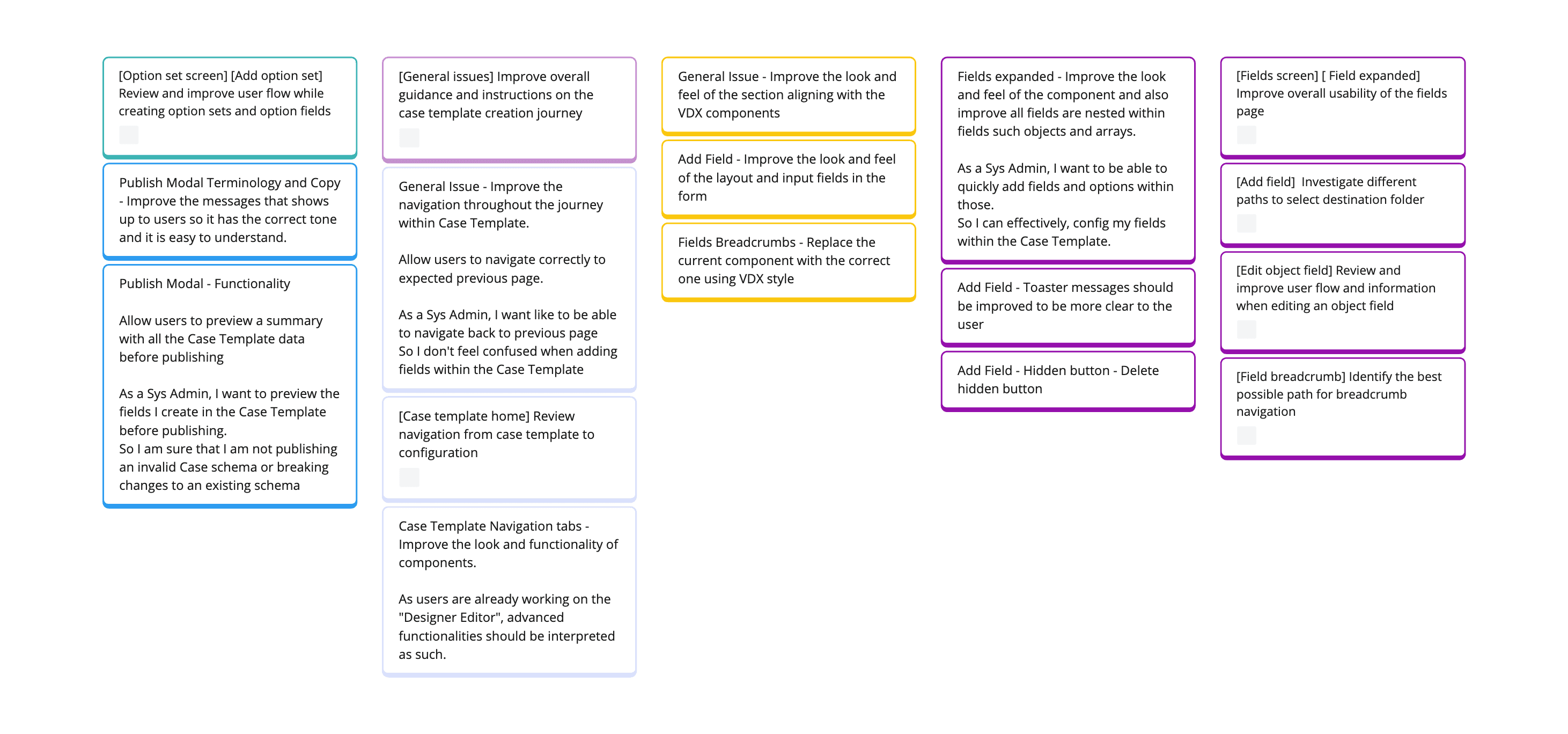
Labelling and categorising the issues helped us build a backlog of work and also understand which area in the feature require more investigation.
User Flow
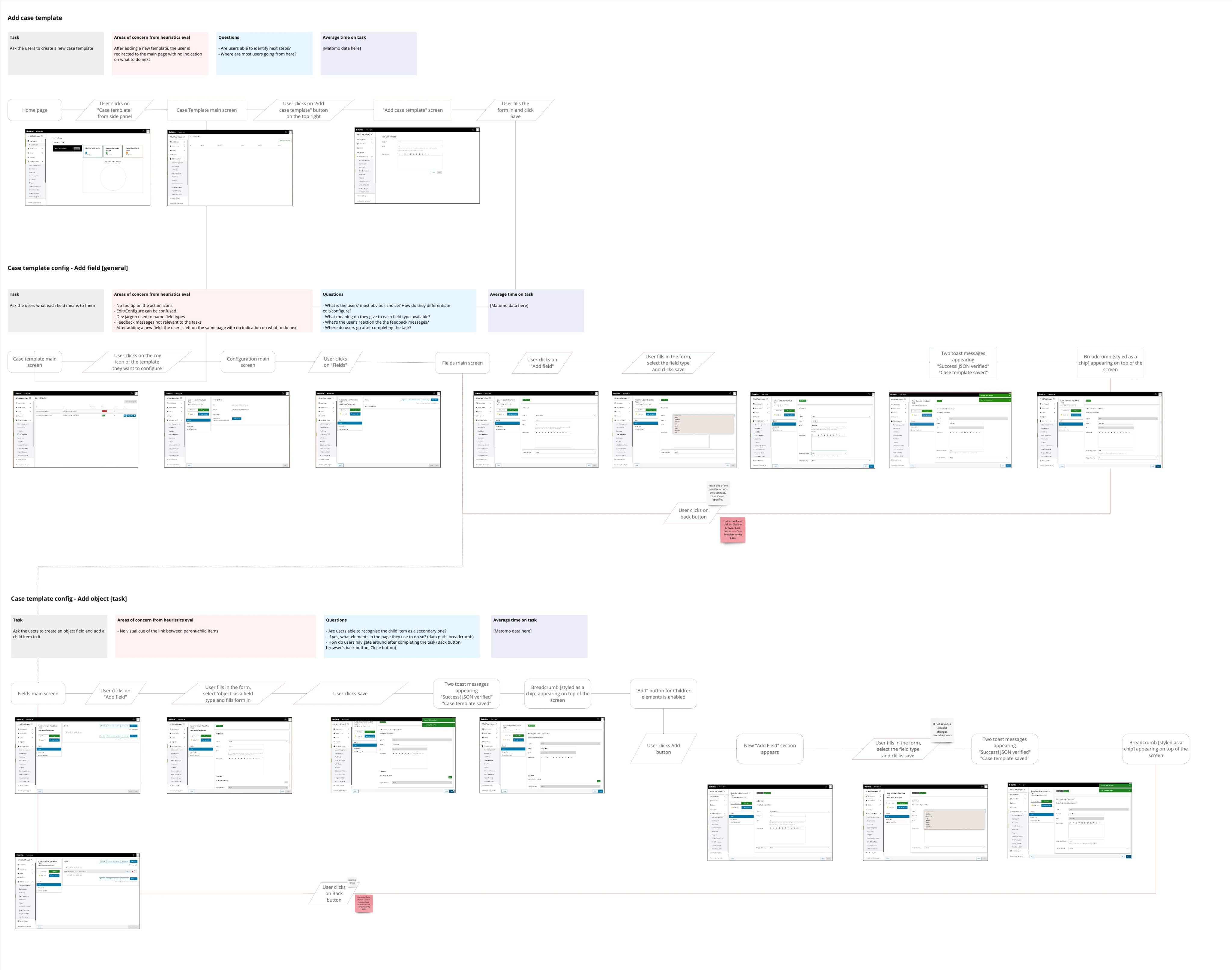
Mapping the journey helped to segment the investigation by the tasks users were typically doing when adding fields. Furthermore, by having an overview of the flow we could add questions of particular interest within the task.
The UX Research team organised usability testing sessions with diverse users to identify issues in the Case Template, including learnability challenges and ways to prevent and recover from errors.
Task 1: Evaluate the Dashboard page (1) and determine how well it meets users' expectations. Identify challenges in navigation.
Task 2: Create a new Case Template (2-3) and add relevant fields (4-8). This task evaluated how easily users could move across the interface and identify any barriers to completion. Additionally, it considered how transparent the system is in naming the different fields (6).
Tasks Flow

This User Journey used by the UX Research team to plan how they would be doing the Usability Testing by testing their knowledge on how to use the feature. It was important to not only look at the Case Template page but also in the navigation that the user takes to get to be able to complete the task of adding fields.
Research Results
Key metrics and participant ratings were gathered to quantify the experience. Identified issues were ranked by severity to prioritise roadmap planning.


Usability Findings and Roadmap Priorities
High Impact Issues:
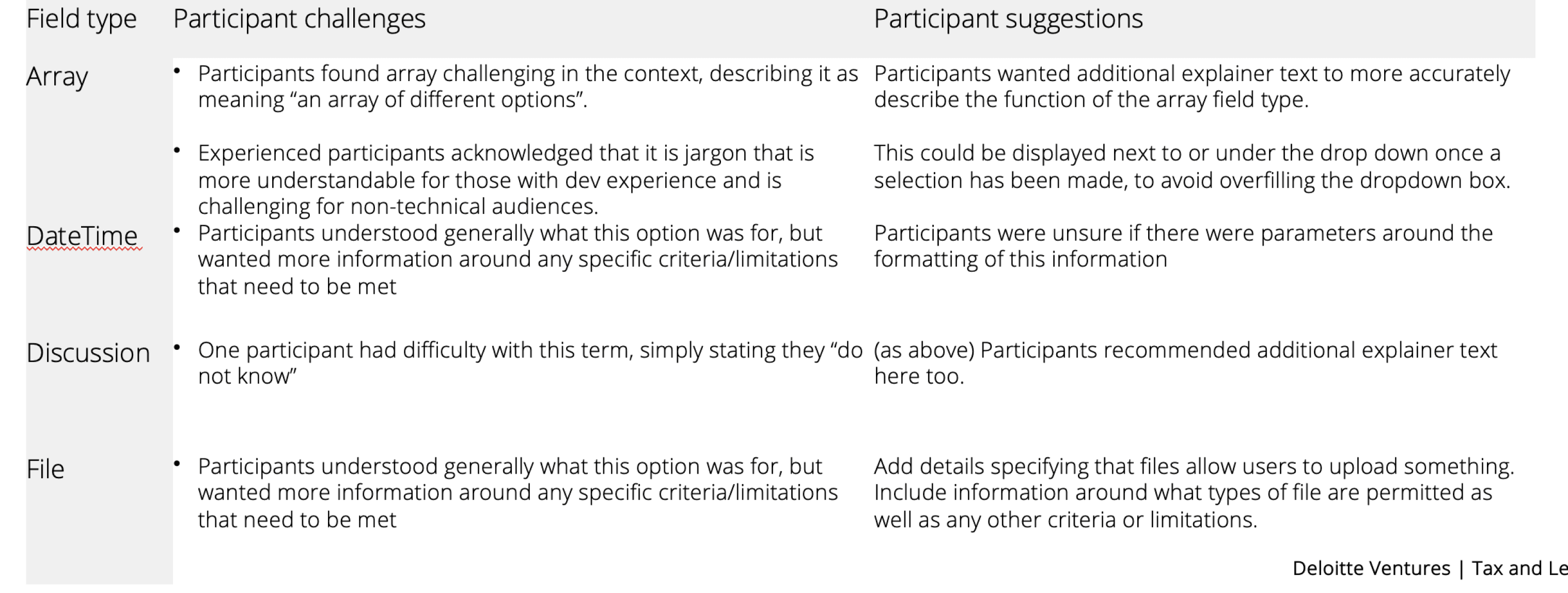
Dashboard Navigation (Terminology): Confusing and inaccurate terminology in navigation menus led to delays, confusion, and incorrect selections. This highlights the need for clear and consistent language that matches real-world terminology.
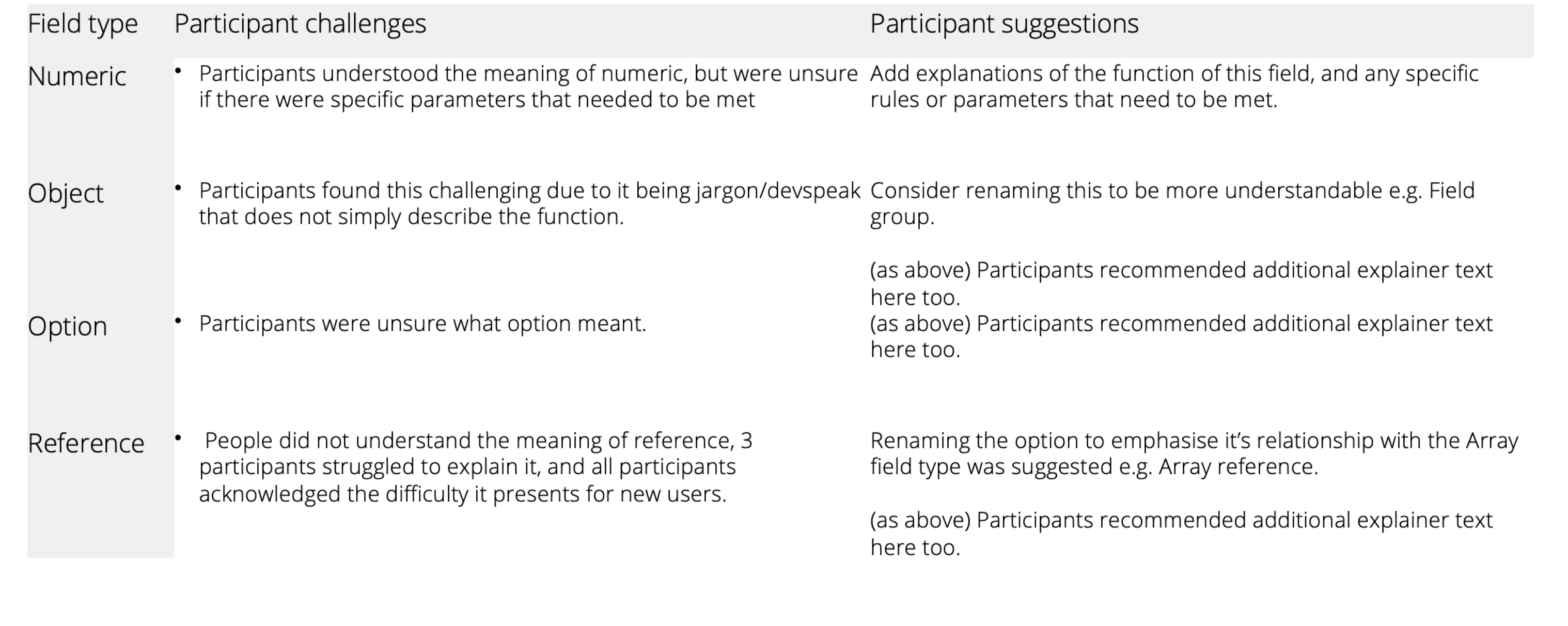
Field Names: Technical jargon and confusing field names on the "Add field" screen caused delays and errors. The solution is to use plain language and familiar terms that users easily understand.
Error Recovery: The inability to delete fields and the unclear error message create frustration and confusion. Users need accessible error prevention and clear recovery options.
Medium Impact Issues:
Dashboard - Data Visualisation: Users struggle to understand the progress and ownership of current work items due to unclear data visualisation. Implement intuitive dashboards that clearly convey progress and responsibility.
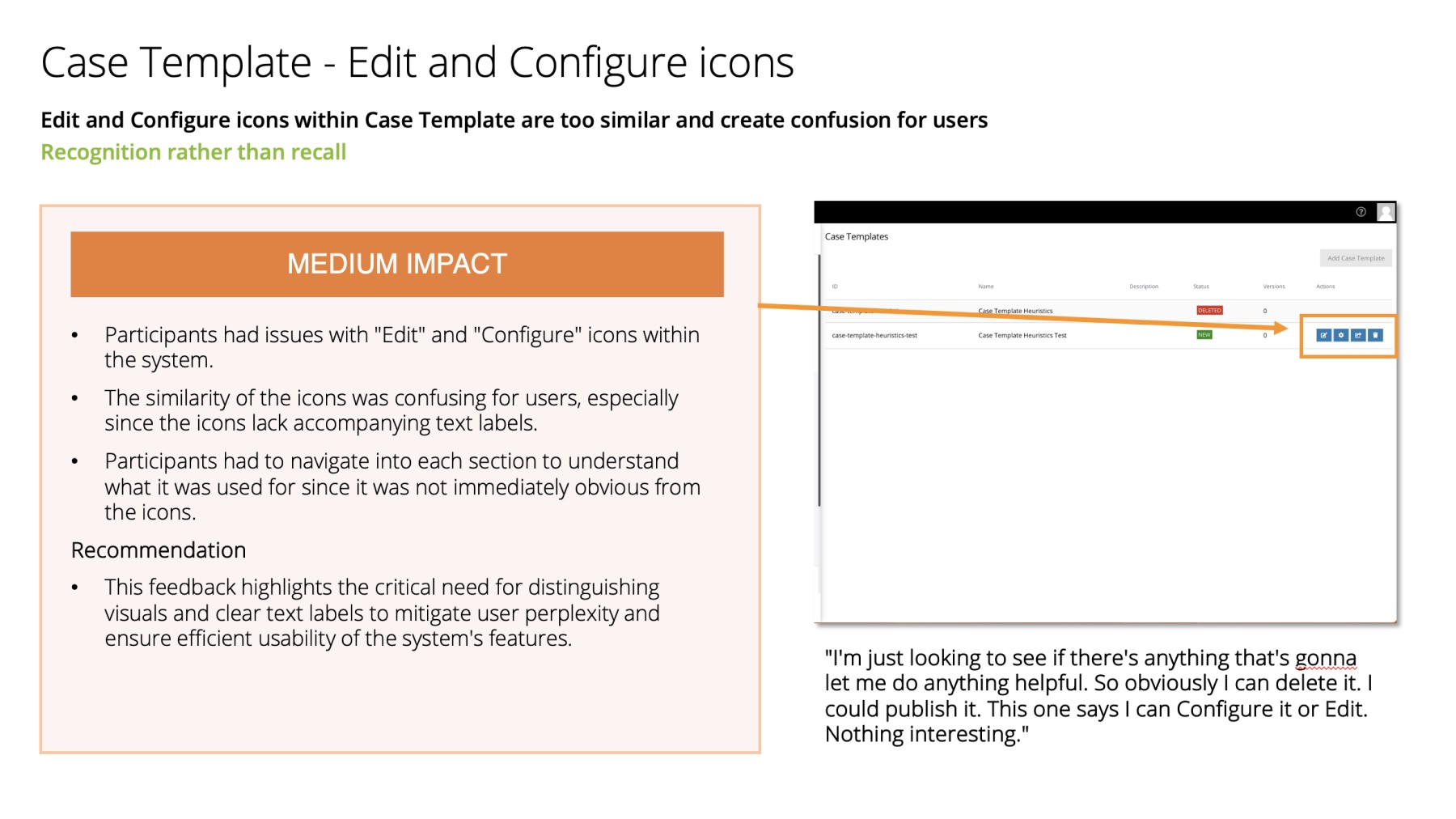
Edit/Configure Icons: Similar icons for editing and configuring fields lead to confusion. Use distinct and recognisable icons for different actions.
Navigating Away from Saved Fields: After saving a new field, users must manually navigate back to the overview, wasting time and causing confusion. Streamline the workflow by automatically returning to the overview.
Trigger Ranking: Users find the "Triggers ranking" button unclear and potentially redundant. Provide clear explanations and context for this feature.
Repeated Buttons: Multiple buttons with the same function in the configuration screen lead to mistakes. Remove duplicate buttons or consolidate their functionality for clarity.
"+" Button Confusing: The small "+" icon for adding child objects creates confusion and errors. Use consistent and intuitive icons for different actions within the object field.
We can significantly improve user experience, reduce errors, and increase overall system usability by addressing these issues through the roadmap.


Fields Terminology
Discovery questions


Information Architecture
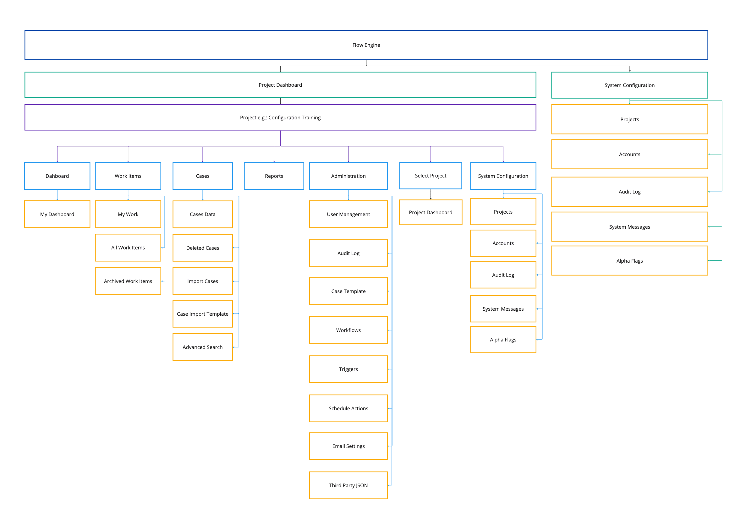
Mapping the Information architecture helped to have an overview of the platform and showing the relationships of its contents and functionality.
I took the initiative to recreate the information architecture and make user flows, aiding the UX Research team in planning practical usability tests.