Introduction
Lambeth College, a bustling further education institution with two campuses serving nearly 10,000 students, recently joined the LSBU Group as part of a pioneering initiative to integrate further and higher education.
The college's marketing team embarked on a visual identity refresh to reflect this exciting transition, aligning with the group's branding.
Problem
Research revealed a pressing requirement to overhaul the college's website. Users were bouncing at an alarming rate (62.3%), spending barely 2 minutes on the site. Optimising user experience and interface was vital to reducing bounce rates and boosting conversions.
Process
We collaborated closely with the Marketing Manager and Developer to define project goals. A comprehensive analysis followed, utilising Google Analytics, heatmaps, competitor research, and user interviews with 40 students and staff.
This deep dive pinpointed pain points:
Confusing navigation
Inaccessible search
Lack of engaging content
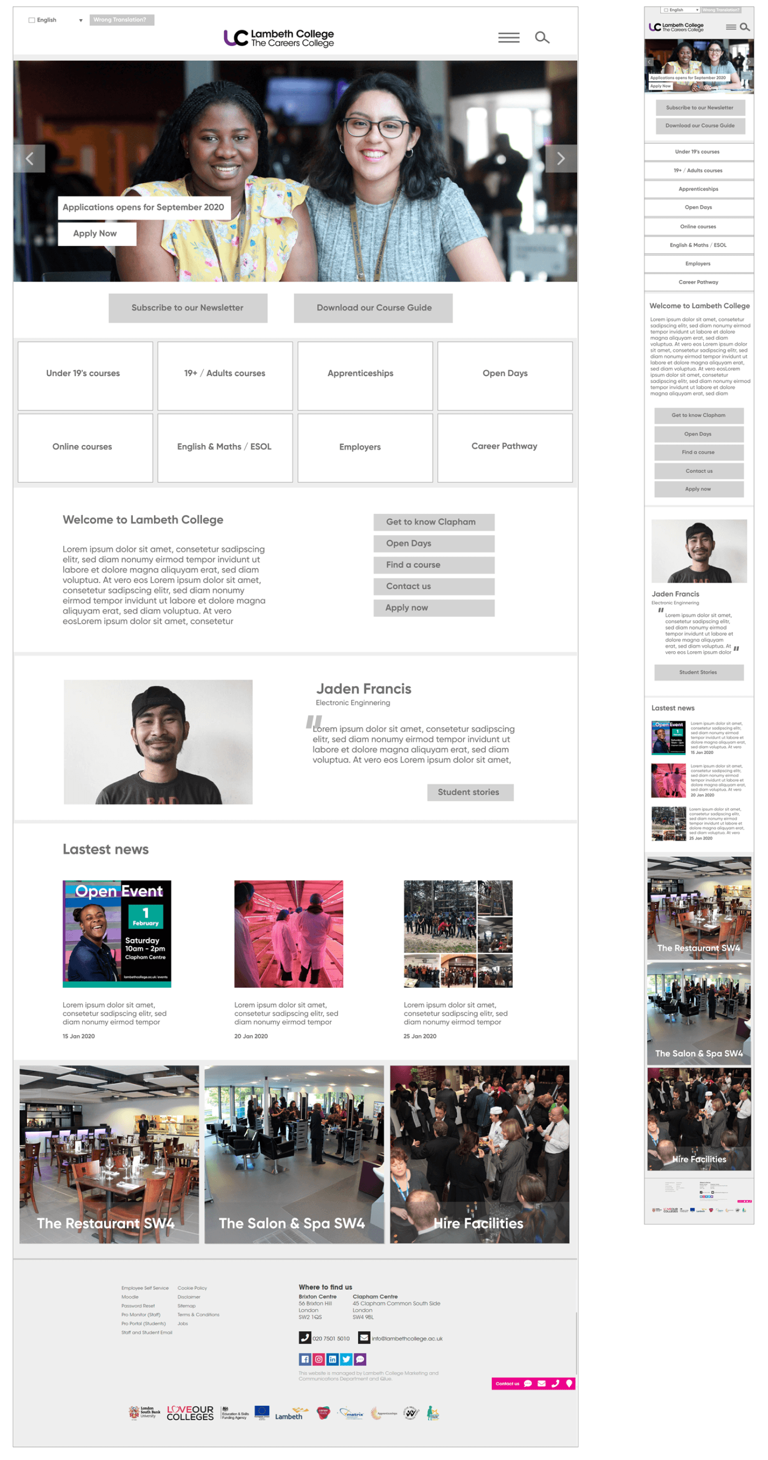
UX/UI Design | Proposed Design
Student's Experience
Print & Digital
Marketing Assets
Presentation Design
Logo Design
Client
Lambeth College
Industry
Education
Timeline
6 months
Role
UX/UI Designer

User Research
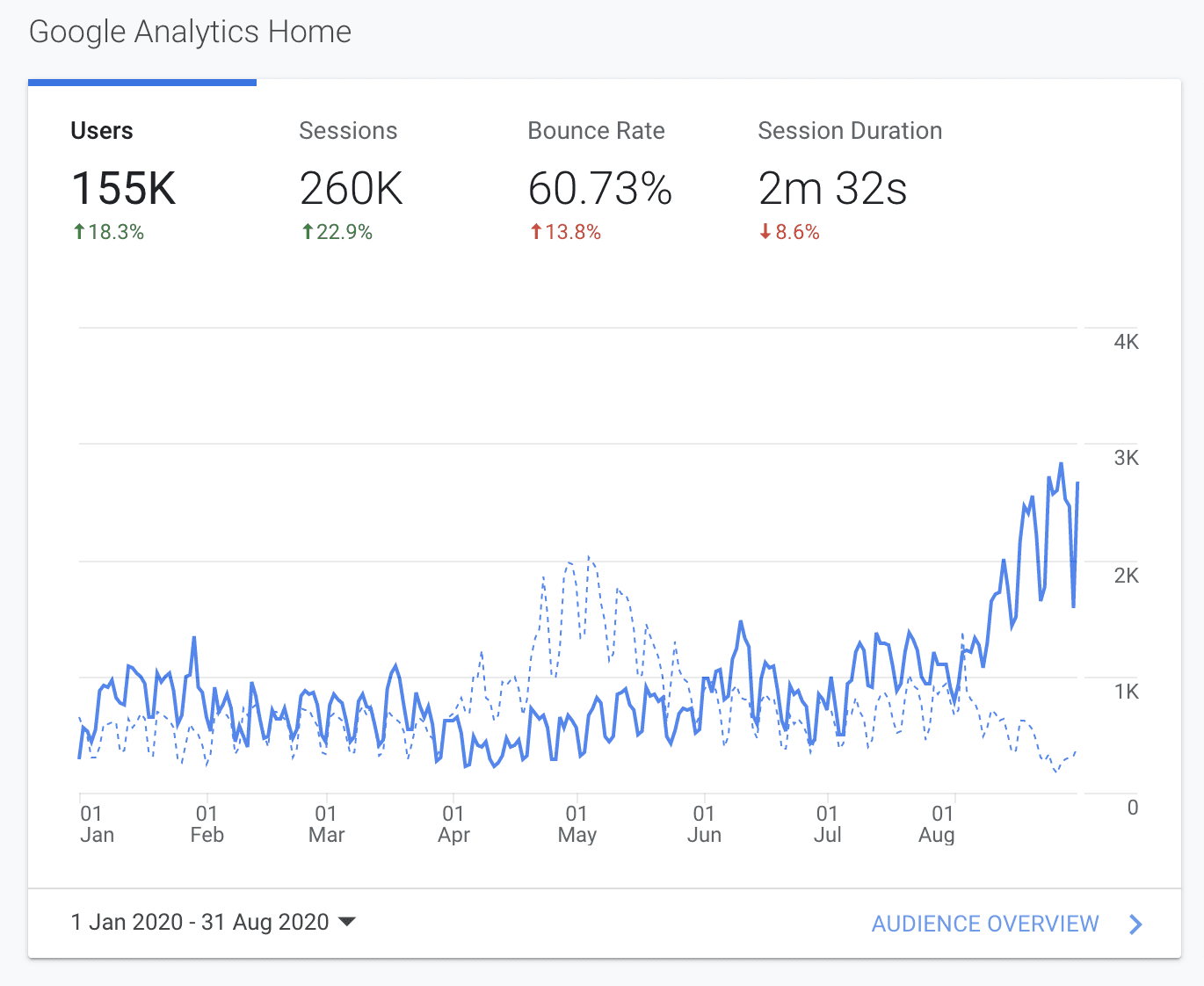
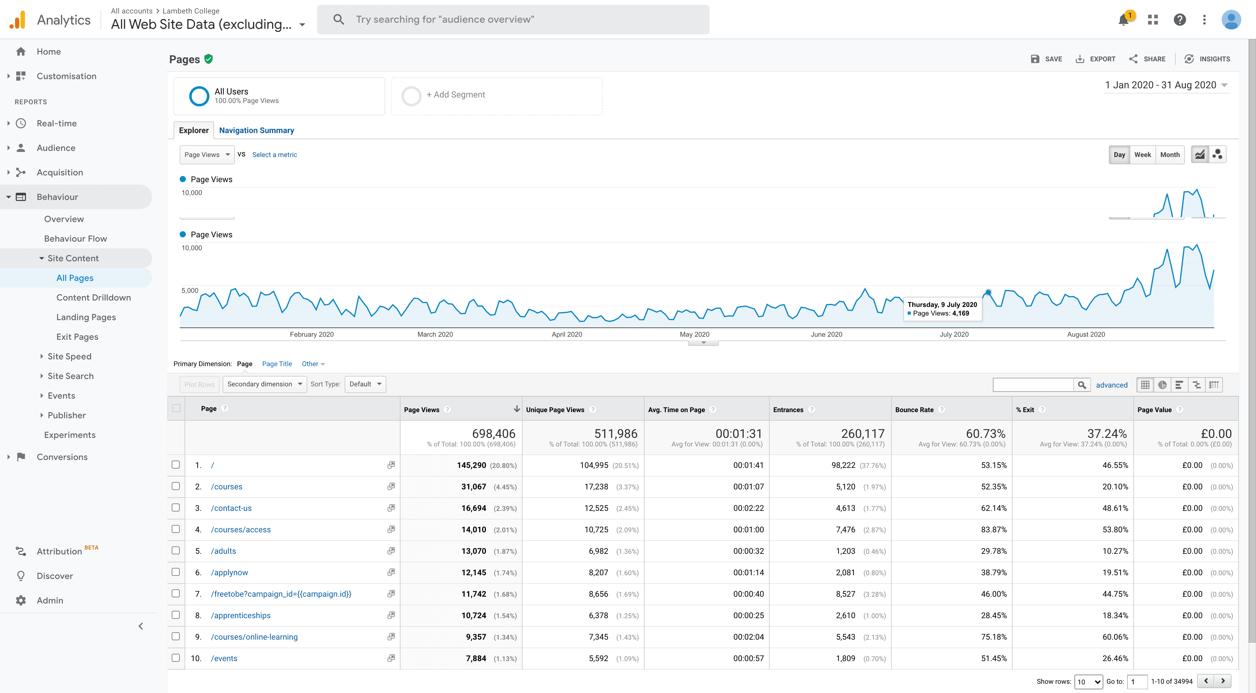
Firstly, we analysed data from Google Analytics to identify the website's performance and user behaviour. Some of the main insights were:
The website's bouncing rate is above the average; at the moment of the research, it reached 62,3%, and users spent around 2m on the website.
We identified the main visit pages and their bounce rate.
The user behaviour helped us map the user flow within the website and the pages showing more drop-offs and traffic percentages.
Analytics

Heat-map


Wireframing
I created low-fidelity prototype wireframes to address core functionalities and conducted usability tests with four participants. This feedback informed the adaptation of user experience changes and subsequent iterations.
I performed a heuristic evaluation across the website, yielding the following key insights:
Visibility of System Status: The website's navigation can be enhanced by incorporating breadcrumbs, providing continuous updates on the users' location and facilitating their rescue from deep searches or links.
Error Prevention: Currently, the website features separate search components for course and content searches. Combining them into a unified global search with filtering elements would enhance user experience and prevent errors.
Aesthetics and Minimalist Design: The website's visuals, buttons, links, and page layouts deviate from design guidelines. There is a need for increased consistency and adherence to graphic standards for a more cohesive and aesthetically pleasing user experience.
Informed by competitor analysis on how other colleges organise content on their homepages, we identified the significance of "Latest News" and "Student Stories" for profile-raising. Consequently, redesigning these sections was deemed essential.
User research, with input from 40 students and staff, highlighted the following main insights:
The search bar needs to be more accessible.
There is a desire for more video content.
Improved communication on essential information, including terms, dates, student outcomes, and COVID-19 announcements.
Post-research, several trends emerged necessitating attention in the subsequent design stage:
Site Information Architecture and Navigation: Restructuring is required to enhance site information architecture and navigation.
Consistency and Visual Guidelines: The website needs an update to align with consistency and visual guidelines, as the current state leaves users needing more attention.
Broken Links and Pages: Addressing broken links and pages lacking content is crucial for an optimal user experience.
Media Diversity: There is a need to incorporate various media types, particularly videos.

Prototypes
Considering research insights and the updated visual language, I designed new layouts for handover to the developer, ensuring consistency and ease of reuse through a design system. Examples of the final UI were created using AdobeXD.
I performed a heuristic evaluation across the website, yielding the following key insights:
Visibility of System Status: The website's navigation can be enhanced by incorporating breadcrumbs, providing continuous updates on the users' location and facilitating their rescue from deep searches or links.
Error Prevention: Currently, the website features separate search components for course and content searches. Combining them into a unified global search with filtering elements would enhance user experience and prevent errors.
Aesthetics and Minimalist Design: The website's visuals, buttons, links, and page layouts deviate from design guidelines. There is a need for increased consistency and adherence to graphic standards for a more cohesive and aesthetically pleasing user experience.
Informed by competitor analysis on how other colleges organise content on their homepages, we identified the significance of "Latest News" and "Student Stories" for profile-raising. Consequently, redesigning these sections was deemed essential.
User research, with input from 40 students and staff, highlighted the following main insights:
The search bar needs to be more accessible.
There is a desire for more video content.
Improved communication on essential information, including terms, dates, student outcomes, and COVID-19 announcements.
Post-research, several trends emerged necessitating attention in the subsequent design stage:
Site Information Architecture and Navigation: Restructuring is required to enhance site information architecture and navigation.
Consistency and Visual Guidelines: The website needs an update to align with consistency and visual guidelines, as the current state leaves users needing more attention.
Broken Links and Pages: Addressing broken links and pages lacking content is crucial for an optimal user experience.
Media Diversity: There is a need to incorporate various media types, particularly videos.
About us

Course Explorer

Course Page

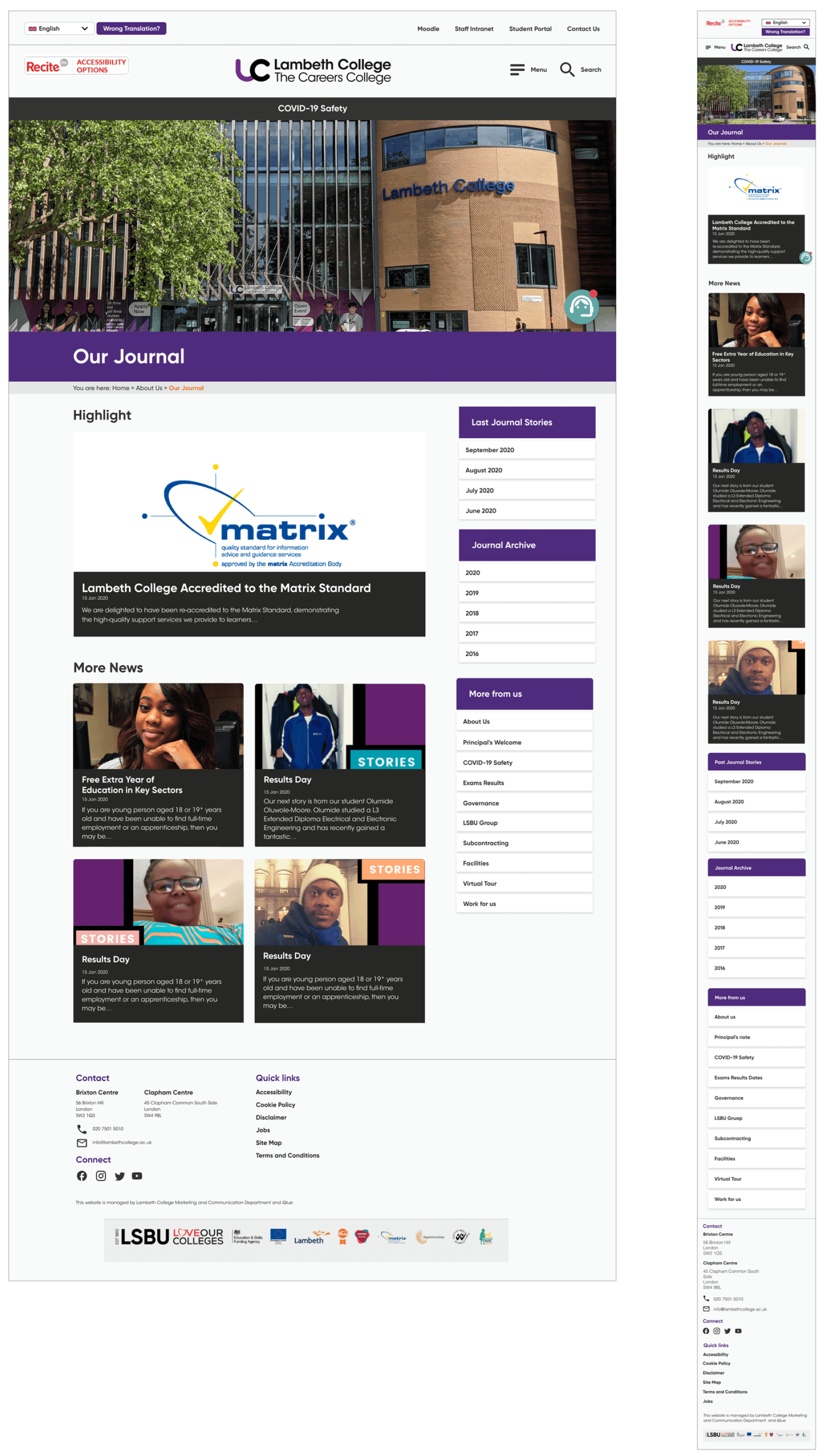
Our Journal Page
Contact Us Page
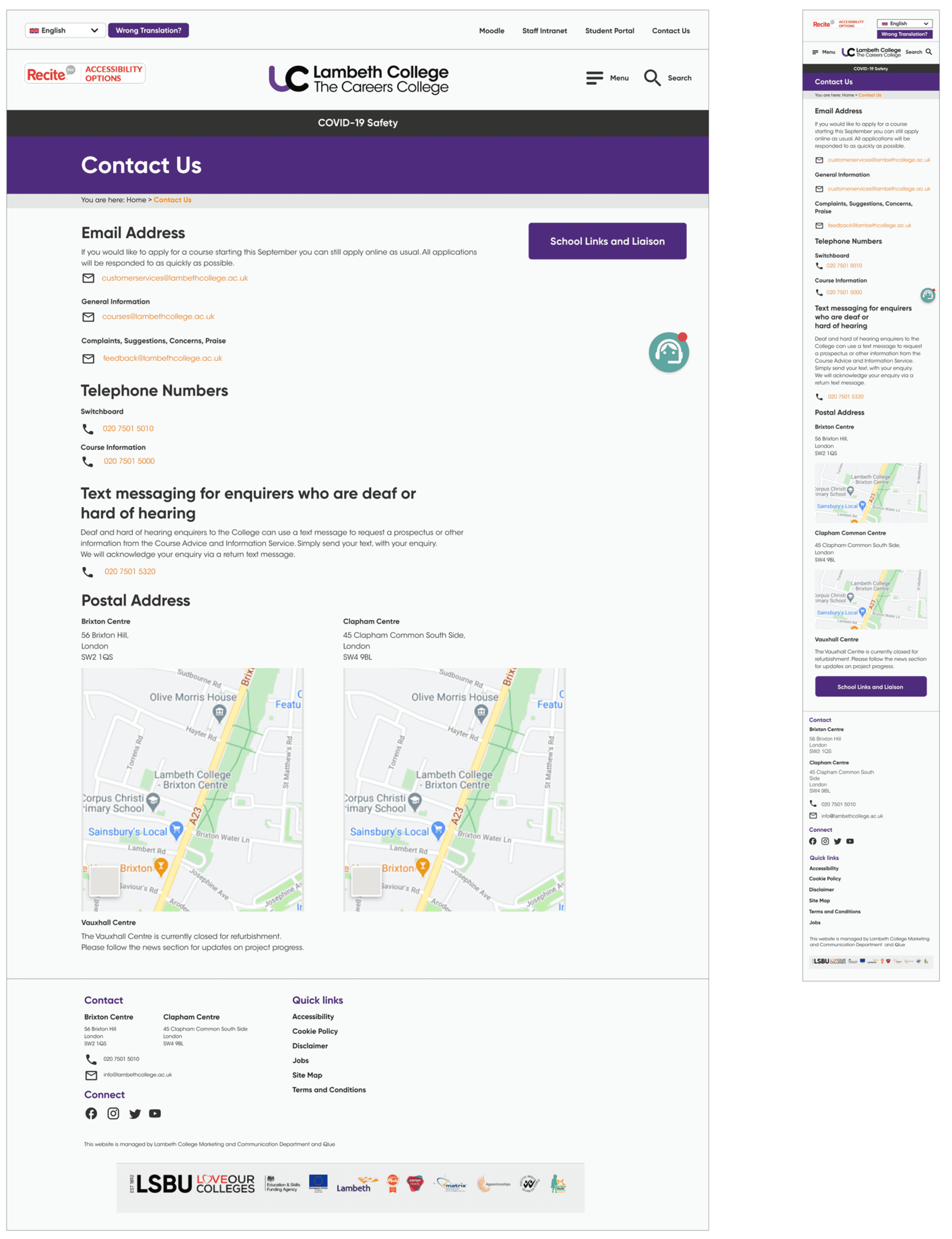
Visual Brand
Aligning with the college's refreshed design guidelines, the website's visual language and design system underwent changes, incorporating a new colour palette for various purposes.
Homepage
Current page


Insights
The design underwent testing for feedback and improvement. The architecture was revisited as the website redesign progressed, addressing content grouping for improved user experience.
While time constraints influenced the design process,the deliverables initiated discussions about enhancing the user experience across various touch-points, from customer service to enrolment and marketing, with plans for website implementation in the future.
Previous Project