Project
(A)
Overview
(B)
Problem
Outcome
Info
(C)
Role
Timeline
Team
Tools

Design Sprint
(D)
This project aimed to identify inconsistencies within the use of colours in the Ventures applications, improve accessibility standards, and ensure a cohesive visual identity that aligns with Deloitte’s brand guidelines and user experience goals.
Week: 1
I initiated the project by analysing the current guidelines to evaluate their accessibility and the roles that we currently assign.
Also, I interviewed about 10 designers and 5 developers about the implementation and criteria for the colour choice, how the colour palette was being implemented, and any pain points they encountered regarding keeping consistency.
Week: 2
After collecting the findings from the user interview and identifying the main opportunities, my second task was to collaborate with Deloitte’s Branding team on how to adapt the current colour palette for web use.
The existing colour palette was first thought for a printing perspective and lacked the flexibility for web applications.
Week: 3
Once I had all the insights needed to complete the evaluation, I went to rework the colour palette, check for accessibility issues, set up variables' naming conventions and roles, and update existing guidelines.
Afterwards, I proposed new guidelines that expanded the current palette and ran a focus group with Designers and Developers to gather feedback.
Lastly, once the palette was refined and approved, I worked closely with developers to implement the changes to the colour system.
User Research
(E)
I conducted user interviews with designers and developers to uncover the challenges they face when using the current color palette.
of Designers and Developers struggled with the overwhelming number of colours, inconsistent visual hierarchy, and difficulty maintaining brand consistency across platforms.
of Designers and Developers mention the lack of accessible colour pairings and difficulty adhering to WCAG standards for user impairments, such as colour blindness.
of Developers face challenges when implementing an extensive, unstructured colour system and maintaining it across themes or platforms.
Platforms Screenshots
(F)


Existing Colour System
(G)

Proposed Colour System
(H)

Testing Dark Mode Background
(H)

Guideline #1
(I)
To strengthen the colour system implementation, I suggested reorganising the styles into variables that designers could access. The aim was to introduce new categories:
Brand: List of all the colours on the colour palette.
Alias: Grouping colours that make it easier to understand what the colour represents
Mapped: Defining the baseline colour themes.
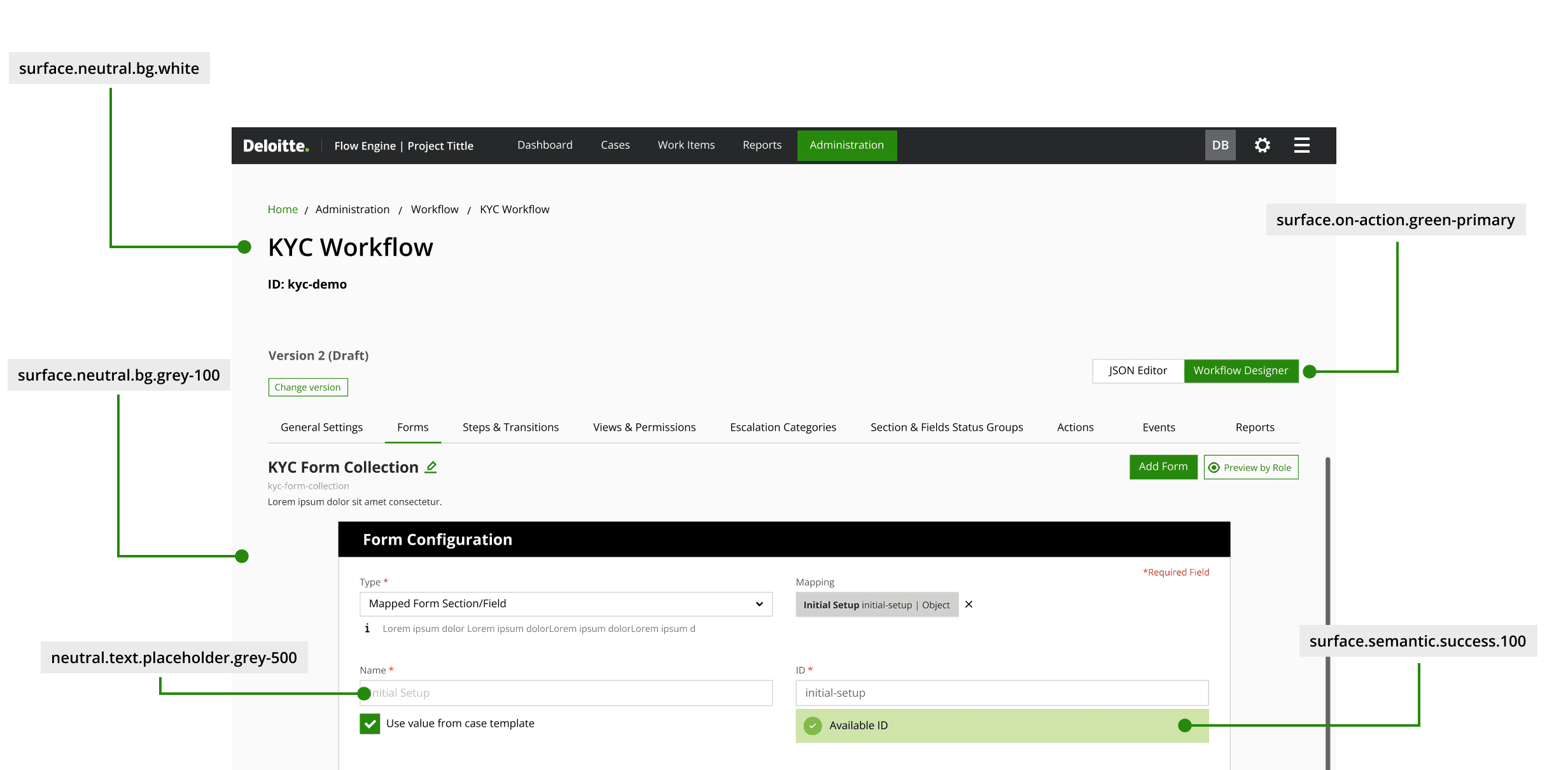
The colour tokens would support a complex and scalable token structure that allowed for the creation of individual themes for elements in the design system, making updates and management easier.

Guideline #2
(J)
Creating a baseline colour theme for the product was driven by the need for versatility and consistency across diverse user interfaces.
Moreover, by incorporating multiple built-in themes, we allowed users to personalise their experience. This adaptability not only enhances accessibility and engagement but also allows users to select a colour scheme that resonates with their individual preferences, making their interaction with the product more enjoyable.
This approach simplified the creation process for designers by offering a flexible yet cohesive foundation, reducing the time spent on manual colour adjustments, and allowing them to focus on enhancing user experience.

Guideline #3
(K)
Testing the colour system across various visual impairments, such as protanopia, deuteranopia, and tritanopia, revealed key insights on contrast effectiveness, ensuring the palette remained distinguishable and accessible to users with colour vision deficiencies.
Upon testing the initial set of graph colours, I realised that the bright colours had the same hue, and to avoid confusion and possibly confuse users, those colours were removed from the colour palette.

Guideline #2
(J)
Appropriately using specific colours in the design system was critical in making data visualisation successful.
Ensuring those colours had appropriate contrast from the primary colour group was essential so visual or graphical visualisation formats are easily distinctive from UI elements.
It's important to note that using multiple colours in data visualisation is not arbitrary. It is reserved for scenarios where we need to differentiate between data categories, thereby improving data comprehension.

Insights
(L)
My collaboration with the Developers on the new colour system implementation allowed for easier re-work when auditing the current platforms.
The assignment of roles on the colour system allowed Developers to easily identify buttons, icons, notifications, and messaging elements and apply the new token naming convention.
Lessons Learnt
(L)
01
Adapting Graphic colours for Digital use
During the initial investigation, it was noticed that the primary colour palette often didn’t translate well for web environments.
Iterative testing, a process in which the team played a crucial role, allowed me to fine-tune the palette. This made it more flexible, taking into account web accessibility, contrast ratios, and user interaction.
Expanding the colour palette to include shades, tints, and other hues allowed us to create a versatile system that could adapt to different UI components, improve hierarchy, set up variables and guidance on their correct use, and ensure consistency while applying common and best practices in the design system.
02
Need for Accessibility and Colour Misuse
The initial palette didn’t provide enough guidance on accessibility, and some platforms had issues meeting contrast requirements, such as inconsistency and misuse of brand colours in digital products.
This reinforced the need to prioritise accessibility from the start, ensuring that every colour placement has the necessary contrast for text readability, that colour has specific roles, and that visual cues should be integrated into UI elements to quickly identify any actions or messages the user needs to take action.
Streamlining the palette into distinct categories (Primary, Semantic, Neutrals, and Graphs) helped designers apply colours more consistently and purposefully, reducing decision fatigue, error in the implementation of element’s styles and consistent colour theme across each department’s products meanwhile keeping the brand identity.