
Info
Role
Product Designer
Timeline
9 weeks
Team
Product Owner
Project Manager
Tech Lead
Developers
(Back/Front - End & QAs)
Tools
Figma
Miro
(A)
The Project
Aimed to allow developers to efficiently manage and be notified of the health state of the APIs from different projects and providers.
How Might We?
"How might we transform the deal management process to create a robust and efficient Merges & Acquisition experience for consultants and buyers.
Outcome
In the first phase, we launched key features focused on user onboarding, streamlined document and media management, and improved collaboration—boosting the business by over 50% in just three months.
(B)
Design Sprint
Each feature was developed in a 3 week Sprint, from conception to delivery.
The successful delivery of essential features for a soft launch is a significant achievement for our project. Despite the challenges posed by tight deadlines and the pressure to deliver the MVP, we overcame them, including the initial resistance from the Product Owner towards a user-centric approach.
To overcome this, we engaged in collaborative sessions to emphasise the importance of user experience processes and foster a shared understanding of user needs and pain points and how to align with business needs.
01
Week: 1 - 3
In the first weeks, I led a user interview to quickly learn what users were experiencing. By interviewing 8 participants, I could define the main pain points so the team could prioritise the development. I also designed the first few screens and outlined the visual style, information architecture, and user flows.
02
Week: 4 - 6
Continuing on prototyping, I designed the overall basic designs for each feature and ran workshop sessions with the team to check on technical feasibility. We collaborated on changes as needed before testing with users.
03
Week: 7 - 8
Once the overall basic designs were set, I ran 5 usability testing sessions to test if the features were usable and valuable. Any insights and feedback on them should be considered and, if needed, changed before development and delivery.
(C)
User Research
I conducted a small context inquiry and user interview study with 12 people between junior and senior Merges & Acquisition consultants.
A challenge here was accessing buyers to understand their needs and goals. So, we consulted the senior consultants' experiences to extract any findings related to that group.
80%
of consultants find the process of document management time-consuming and tiresome.
A structured, well-documented colour system that integrates seamlessly with design systems and front-end frameworks.`
70%
of consultants experienced issues in communication, leading to longer deal processes.
Providing real-time tools for communication between Deloitte and buyers can decrease the gaps in communication and potential misunderstandings.
80%
of consultants expressed concern about the security and privacy of sensitive documents.
Ensuring proper access controls for different buyers to mitigate security risks.
(F)
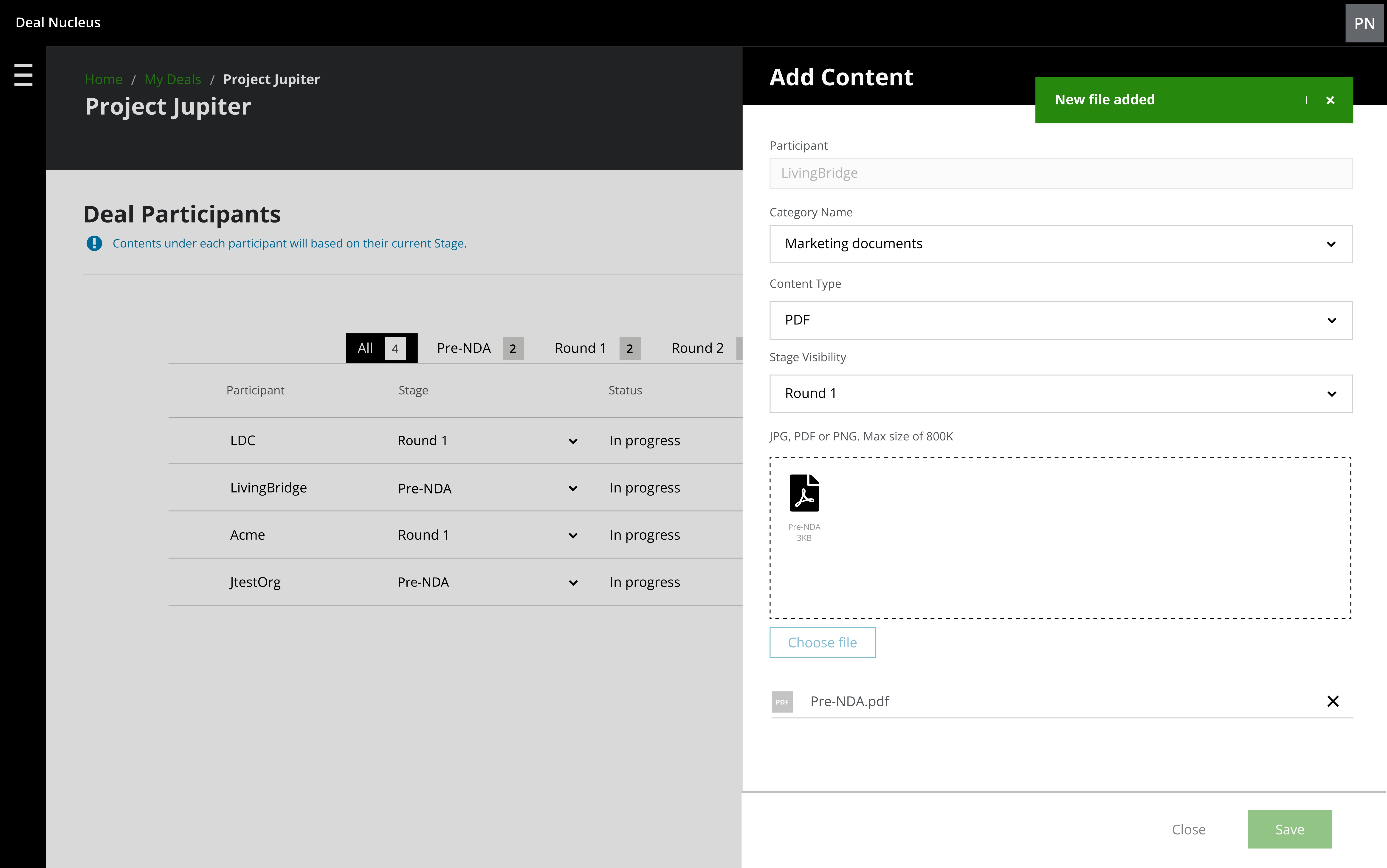
Feature #1
Upload Documents and Media
Simplifies document sharing for specific phases and participants.
Document sharing required precise timing based on each participant's stage in the process. Managing this from uploading to sharing was complex and risky due to the sensitive nature of most documents.
To address this, we introduced the ability to manage content through multiple stages of the process for each participant with a few clicks.
Card Component
Component Iteration
Given the variety of documents and media, the card needed to be concise and able to display a lot of information in a limited space.
Furthermore, the need for a Design System component library that met the product's needs posed a significant challenge. To address this, I investigated the cluster of different types of entries, making items easily distinguishable and organized in compact groups.
This approach enabled me to experiment with various layouts, helping me learn how to present the information meaningfully.

Feature #2
Graph colours
Testing the colour system across various visual impairments, such as protanopia, deuteranopia, and tritanopia, revealed key insights on contrast effectiveness, ensuring the palette remained distinguishable and accessible to users with colour vision deficiencies.
Upon testing the initial set of graph colours, I realised that the bright colours had the same hue, and to avoid confusion and possibly confuse users, those colours were removed from the colour palette.

Feature #3
In-App chat
Another challenging task was keeping track of every consultant's conversation, often leading to gaps and misunderstandings.
To address this, we enabled practitioners to communicate by adding notes related to each participant, ensuring more accessible provenance and security of shared information.
This feature allows users to facilitate immediate responses and seamless conversations.

(G)
Insights
The soft launching of the project enabled us to start monitoring and analysing data on its efficiency and effectiveness.
Deal Nucleus successfully streamlined Deloitte's M&A sell-side process, delivering significant benefits such as increased practitioner engagement, a 90% improvement in document management, collaboration, and transparency, and an 85% decrease in mishandling events related to privacy and security.
(H)
Lessons Learnt
01
Adapting Graphic colours for Digital use
Maintaining effective communication with the Product Owner was crucial to ensuring a user-centric approach, even under tight deadlines and despite resistance from some stakeholders. This collaboration helped prioritise user needs and deliver a successful product.
02
Need for Accessibility and Colour Misuse
We emphasised the value of user research and testing in shaping a successful project, ensuring that user insights and feedback guided our design decisions. This approach validated our assumptions and identified areas for improvement, leading to a product that genuinely meets user needs and expectations.
03
Lack of a Design System
A design system could have helped the design process, leading to consistency, increased development time, and difficulties maintaining a cohesive user experience. Implementing a robust design system would streamline workflows and enhance collaboration among team members.
From idea to impact
You may also like


“Dedicated and detail-oriented designer with a strong growth mindset, always striving to improve and enhance user experiences.”
Ivana D.
Senior Product Designer at Deloitte UK
“Highly creative, hard-working designer with strong project management and communication skills. He excels at meeting deadlines, presenting ideas, and solving design challenges.”
Katherine M.
Marketing Manager at South Bank Colleges
“Proactive and insightful designer who quickly delivers quality work. At Helsa, his clickable prototype played a key role in securing VC-backed accelerator funding.”
Rob C.
Entrepreneur & Fintech Leader
Let's talk
drigofernando@gmail.com