Info
Role
Product Designer
Timeline
3 weeks
Team
Project Manager
Tech Lead
Developers
(Back/Front - End & QAs)
Tools
Figma
Miro
(A)
The Project
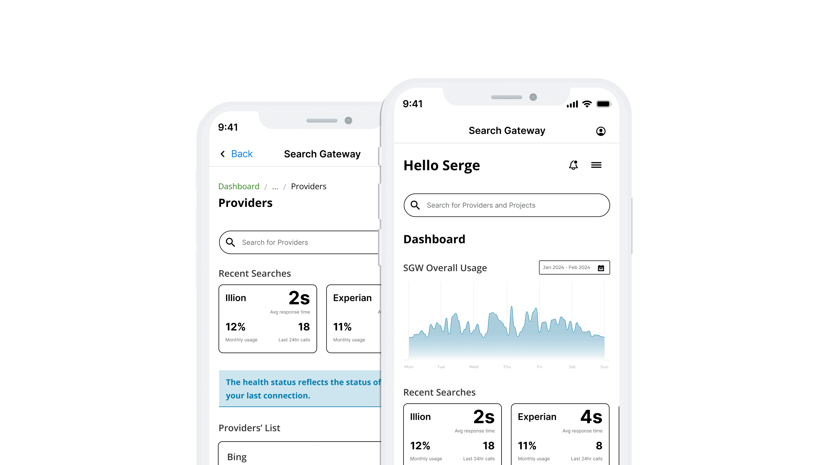
Allows Developers to manage and be notified of the health of the APIs from different projects and providers.
How Might We?
"How can we create a more accessible, intuitive, and feature-rich platform that enables developers to monitor enrolment’s health and fix issues?"
Outcome
Although the design was well received by the developers, the initiative was put on hold on building it due to other projects priorities.
(B)
Design Sprint
I led the research, design process and facilitated workshops with the team.
This project gave me experience working on a complex platform for developers. I needed to familiarise myself with the platform and all the terminology, processes, and tasks they performed with the software.
As it was a project outside the scope of the squad's backlog, I had to quickly devise a solution to present to Senior stakeholders, who would decide the priority for its development.
01
Week: 1
My first task was to familiarise myself with the platform. A couple of meetings with a developer helped me start grasping what the software did and how they used it and ran the tasks.
That also helped me to create my research brief and plan, which I conducted with 7 Developers.
02
Week: 2
In the second week, I shared the insights with the team, and collaboratively, we pinpointed the major challenges. Afterwards, we agreed on a user story and created a user flow to map the main tasks and screens for the platform.
Also, I ran an ideation workshop, where, through a Participatory Design session, I gathered more data on how each developer would approach the challenge. That helped me be more assured of what we wanted to build.
03
Week: 3
After gathering all the ideation data, I designed a low-fidelity prototype of the first screens and conducted usability testing to evaluate users' expectations and needs.
Once I had collected the feedback, I re-iterated the prototype using a mobile-first approach and tested it with a broader range of developers.
(C)
User Research
I conducted task analysis research to understand the different tasks and steps Developers performed in the current platform. I also asked questions related to their goals and how they used the information within the platform.
100%
of Developers thought that the management of the new and existing enrolments were convoluted.
Streamlining the process of managing Projects and Providers would simplify the task and allow for more efficiency when checking their APIs' health and making necessary changes.
100%
of Developers expressed concern about not having ways to look into a project’s log or send requests to providers for testing environments.
Ensure developers can access features that facilitate their work when testing and solving environments' issues.
80%
of Developers mentioned that the layout was confusing, not responsive across both web and app platforms.
Provide a clear information architecture and assume that a responsible platform would allow for an accessible platform.
(F)
Feature #1
Dashboard, Notifications & Portfolio pages
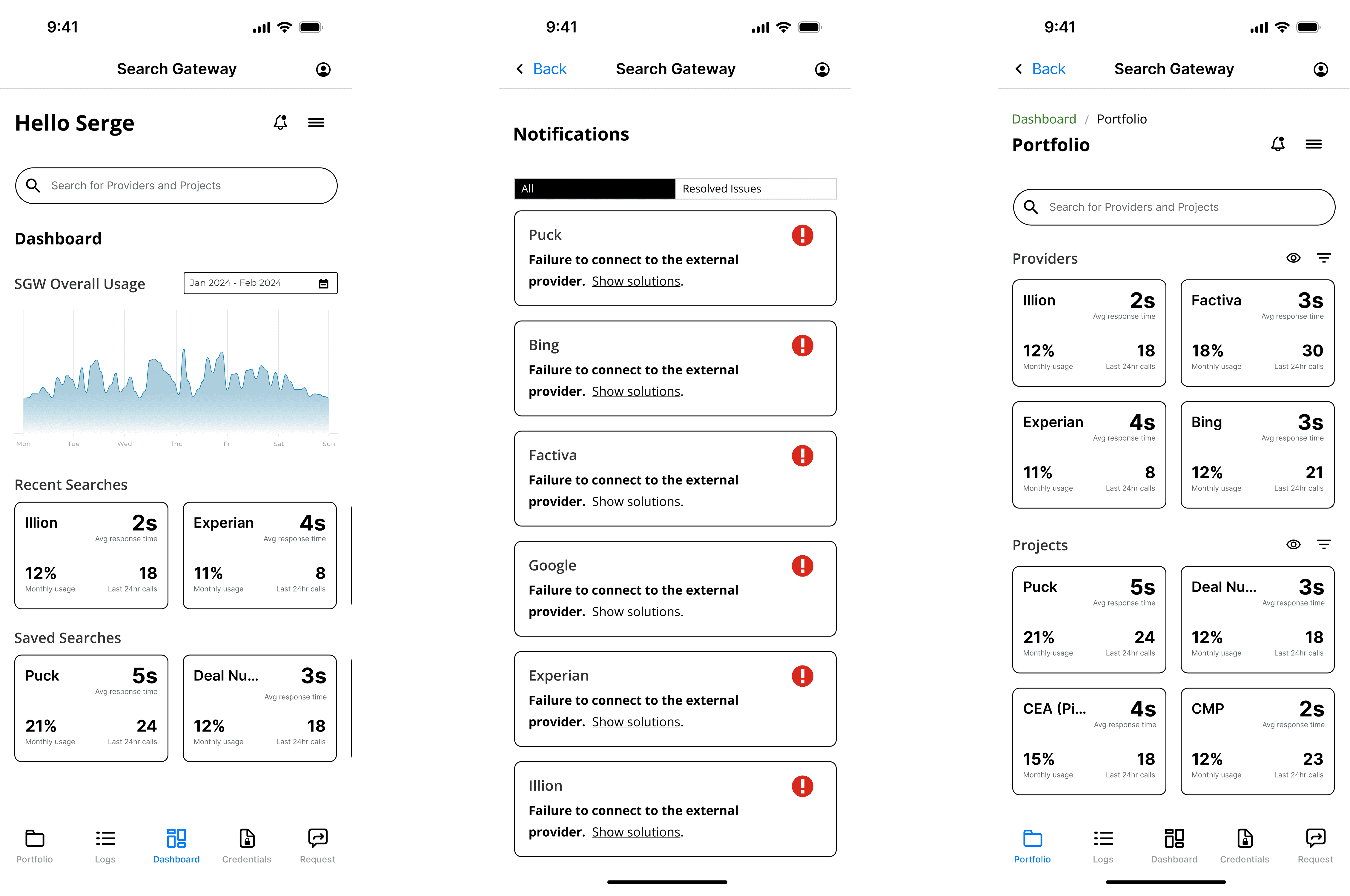
This design addresses developers' concerns about the Search Gateway platform and enhances overall usability, ensuring a more intuitive and practical user experience.
The Dashboard offers comprehensive real-time updates and clear overview information of the systems, allowing developers to see system status insights. It includes a streamlined search function for quickly locating existing environments.
The Notifications page consolidates alerts into a single, easy-to-navigate interface to help prevent errors. It assists users in understanding and resolving issues efficiently, and it displays detailed error descriptions and suggested solutions.
Finally, the Portfolio page delivers an at-a-glance view of providers and projects, facilitating quick access to frequently used enrolments, which supports the heuristic of recognition rather than recall by minimising the cognitive load required to retrieve this information.
Feature #2
Provider's Management page
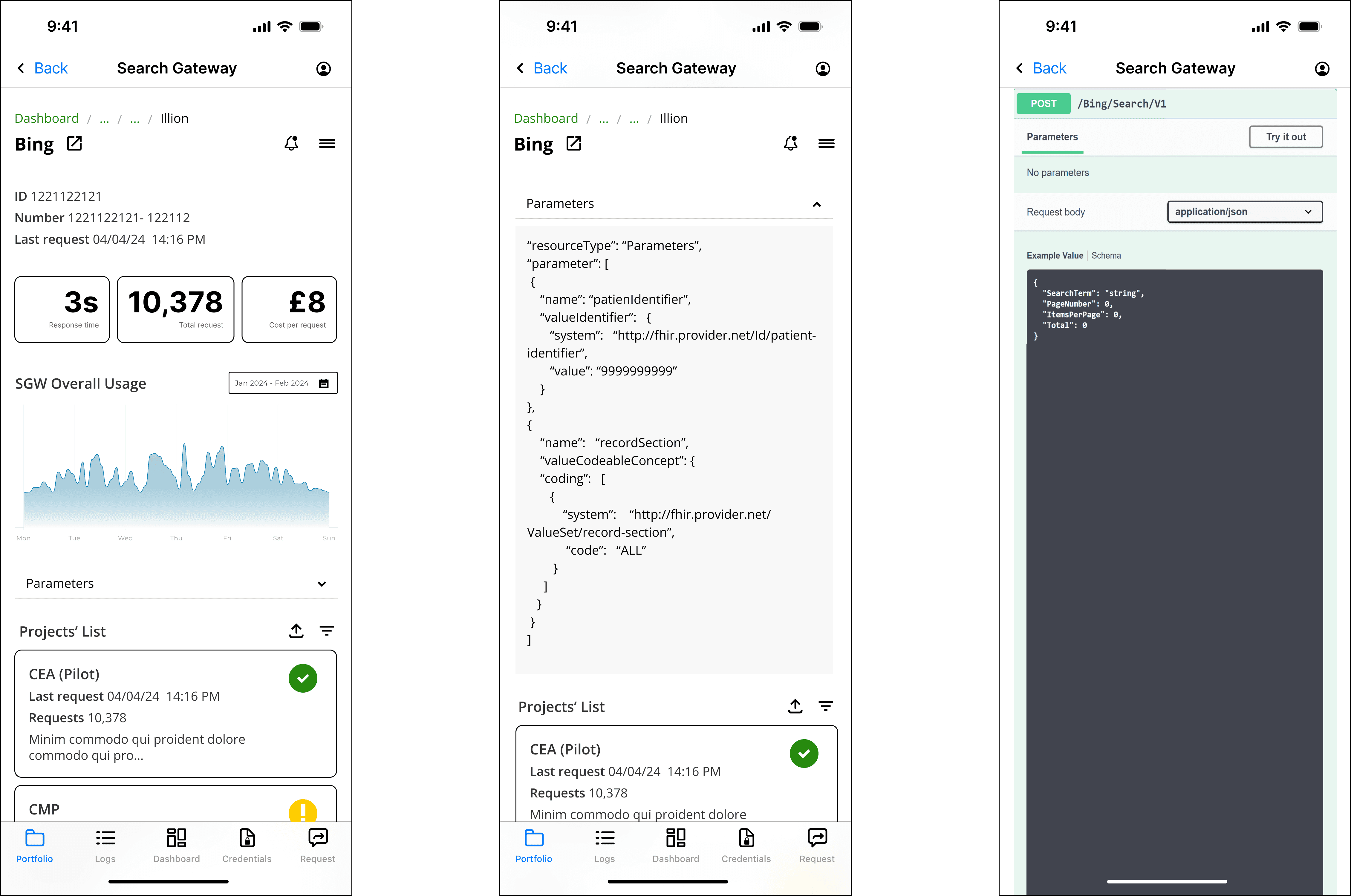
The Provider's page aimed to deliver detailed information about each environment, including its usage statistics, integrated projects, and error information. It ensures users have immediate access to crucial data and the flexibility to adjust efficiently.
This page also enables direct editing within the Swagger interface, streamlining the process for developers.
Feature #3
Logs page
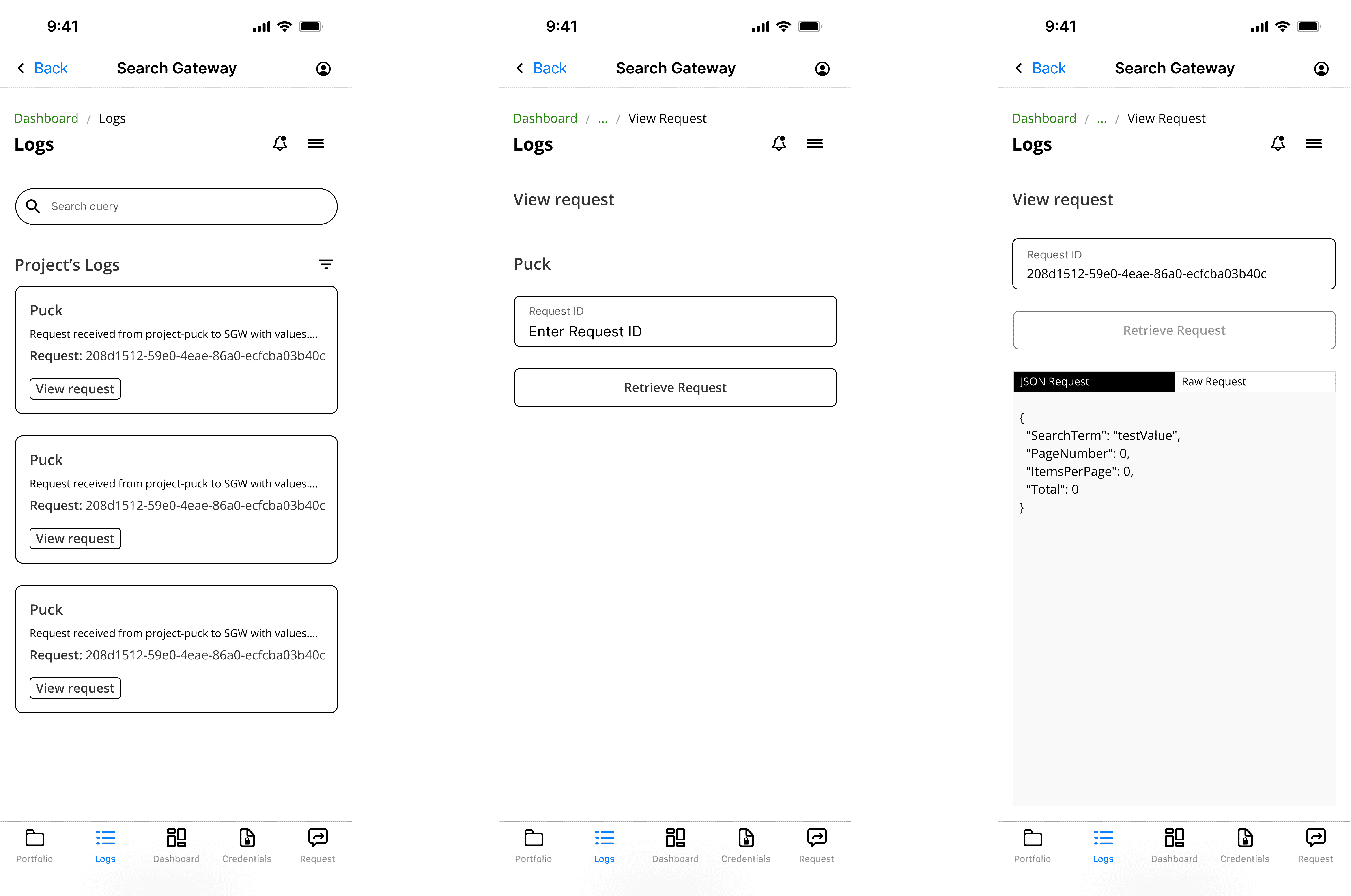
The Logs page displays all logs from the Search Gateway platform. It allows users to search for existing queries and apply filters to find specific logs.
Additionally, developers can retrieve requests to an endpoint, viewing the whole request sent from the Flow Engine in both JSON and raw HTML formats. This feature enhances transparency and debugging capabilities.
(G)
Insights
Rapid prototyping and testing was crucial for reaching the design decisions and coming up with a final design
The developers received the new platform well. They thought having a web and app version was helpful, although they mentioned that we should rethink what features each version would include.
Also, the new user journey felt more intuitive, and less time was spent searching for issues and understanding their causes.
(H)
Lessons Learnt
01
Project Prioritisation
This project was an initiative outside the scope of the team's backlog, so from the start, we assumed it could be put on hold at any moment. We struggled to manage the time of some of the team's main stakeholders, and the project was red-flagged, which could lead to bottlenecks and delayed milestones.
I had to act quickly to deliver a solution to showcase the potential impact and benefit of the improved experience and interface to the developer's work. This approach allowed me to navigate the complexities of the project first to achieve optimal outcomes by focusing on high-impact tasks first.
02
Value of User Research
I initially aimed to maintain feature parity across both platforms, assuming this would ensure a consistent user experience. However, through user testing and feedback, it became evident that users preferred quick, on-the-go interactions such as checking API health status or lines of code on the mobile version while maintaining the comprehensive functionality and more detailed information on the web platform.
Tailoring features to the strengths and context of each platform would improve user satisfaction and engagement and address the distinct behaviours and preferences across platforms.
From idea to impact
You may also like
“Dedicated and detail-oriented designer with a strong growth mindset, always striving to improve and enhance user experiences.”
Ivana D.
Senior Product Designer at Deloitte UK
“Highly creative, hard-working designer with strong project management and communication skills. He excels at meeting deadlines, presenting ideas, and solving design challenges.”
Katherine M.
Marketing Manager at South Bank Colleges
“Proactive and insightful designer who quickly delivers quality work. At Helsa, his clickable prototype played a key role in securing VC-backed accelerator funding.”
Rob C.
Entrepreneur & Fintech Leader
Let's talk
drigofernando@gmail.com
